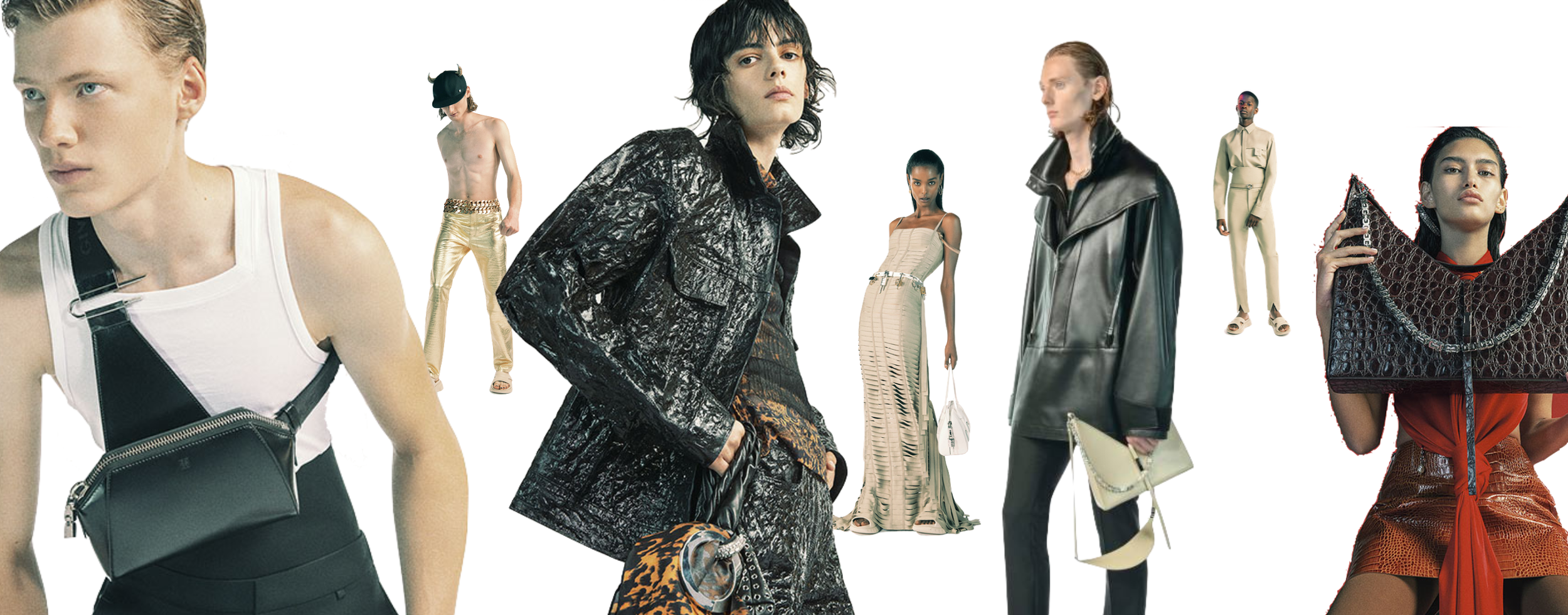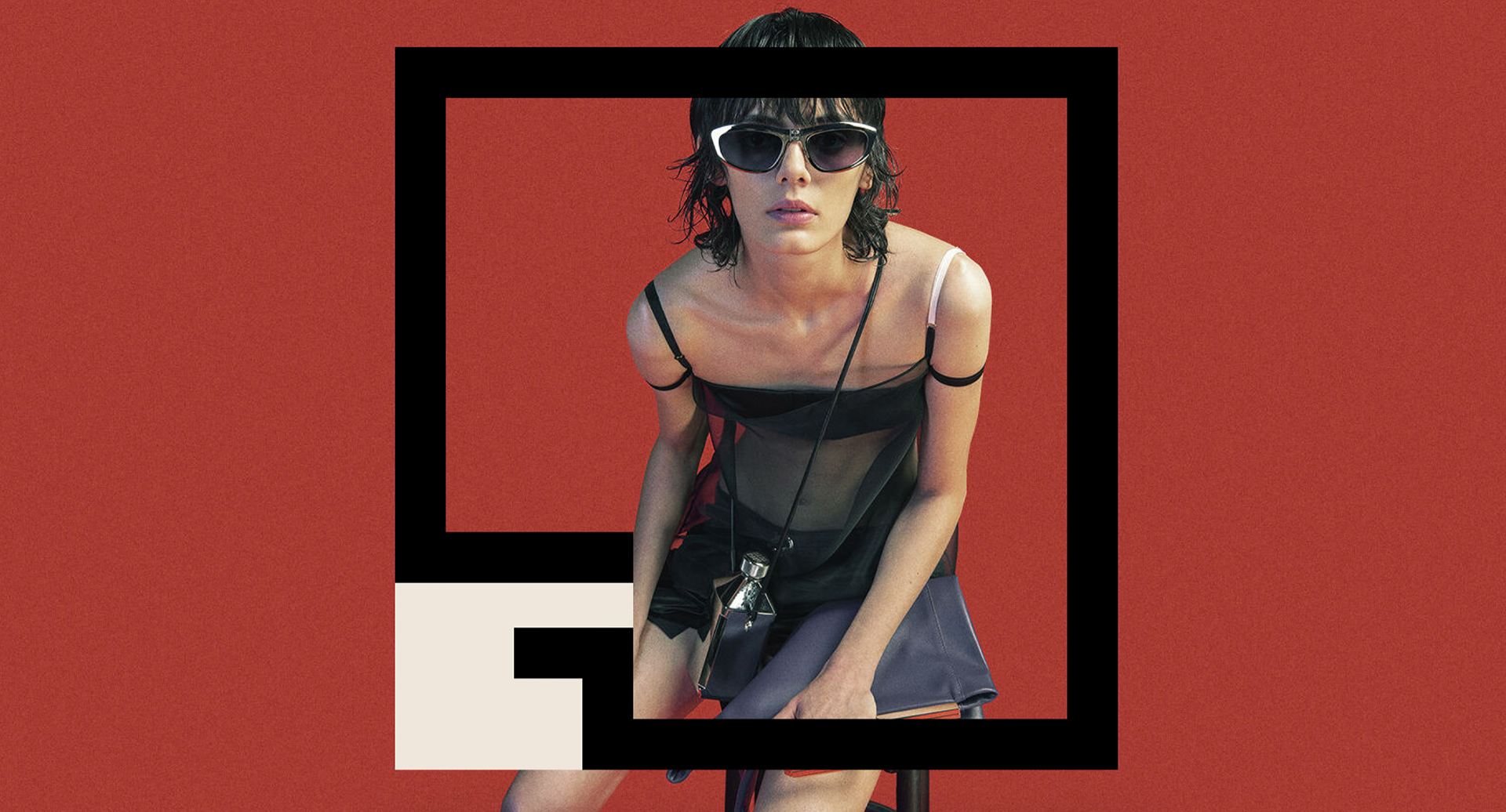
Givenchy:
Brand Identity + Art Direction + Digital
Brief
Create a dynamic rebrand identity for Givenchy by Matthew Williams.
Solution
Considering Matthew William’s more rebellious interpretation of the French house. Decided to create a logo that was out of the box, both literally and figuratively. The abstract and sharp "G" in Givenchy sits over a square box, with the “G” missing its left side, as it does not fit inside. Instead, in the secondary logo, the G forms its own frame. This is meant to symbolize the new Givenchy not fitting within the confines of the fashion industry and instead creating its own space; it’s own world.